Refurbish a website to bring wonderful product experiences.

Duration
Tool Used
Design
Developement
My role
Project team
Background
Kainos was founded in 1974 by Dorothy Phillbrick. Kainos was inspired by the needs of her son, Jim, who has autism. Dorothy and her family dreamed of an environment that would help Jim live a full and joyful life with opportunities to contribute to his community. The mission of Kainos programs and services is to provide a wide variety of residential, vocational and related services, with the highest quality training and support, to adults with intellectual disabilities so that each individual may maximize his or her potential and become an active member of the community. Kainos is a non-profit organization, and users can contribute by donating through the website.
Challenge
Kainos is in need of a new website and brand that helps adults with developmental and intellectural disabilities while motivating audiences for donations and volunteers to sign up. How the design should look like so the website looks warm and inviting for a community like Kainos? How can I incorporate user interface to encourage individuals in need of support to let them feel welcomed? How can I help a website increase donations and number of volunteers?
Solution
The new design is built for different viewports to make the website more user friendly. Create a distinct and compelling brand identity, yet introduce freindly and welcoming UI design theme. Users feel more secured donating by the sophisticated UI design. The page for volunteers includes detailed information to motivate users to sign up. There is a page to tell a story about the origin of Kainos and introduces purposes of the organization.
Design Process
These methodologies help my design decision and build a solid foundation in order for restructuring overall usabilities and user interface. I discover the purposes of redesigning the website, define the user persona and site requirements, design solutions in the form of low to high fidelities and develop a website by transforming the design into pixel perfect code structures.
Discover
Kainos’ main purpose of redesigning the website is passionately to deliver the support needed for adults with intellectual and developmental disabilities. I focused on discovering core issues such as the current Kainos’ pain points and what they are looking for in the new design. Each one of these researches determines my design decision and that help me work efficiently.
The founder shared a list of competitors, five of which shortlisted as the strongest to analyze for the comparative research based on notoriety, visual design, and feature offering.
Define
I created a strong persona based on my research phase. Throughout the redesign of reporting page, I referred back to this persona to ensure that I’m staying aligned with the most important problems that need to be solved and to help inform my design decisions.

After I discovered what the users expect, what the organization needs, and what the competitors do, I went through ideas and discussed the implementation feasibility for each. I took the extra step of categorising these problems into broader epics with visibility into the key areas of the website that needed to be addressed from a usability standpoint. This process helped me prioritize usability issues in order of need and shaped the product prioritization.
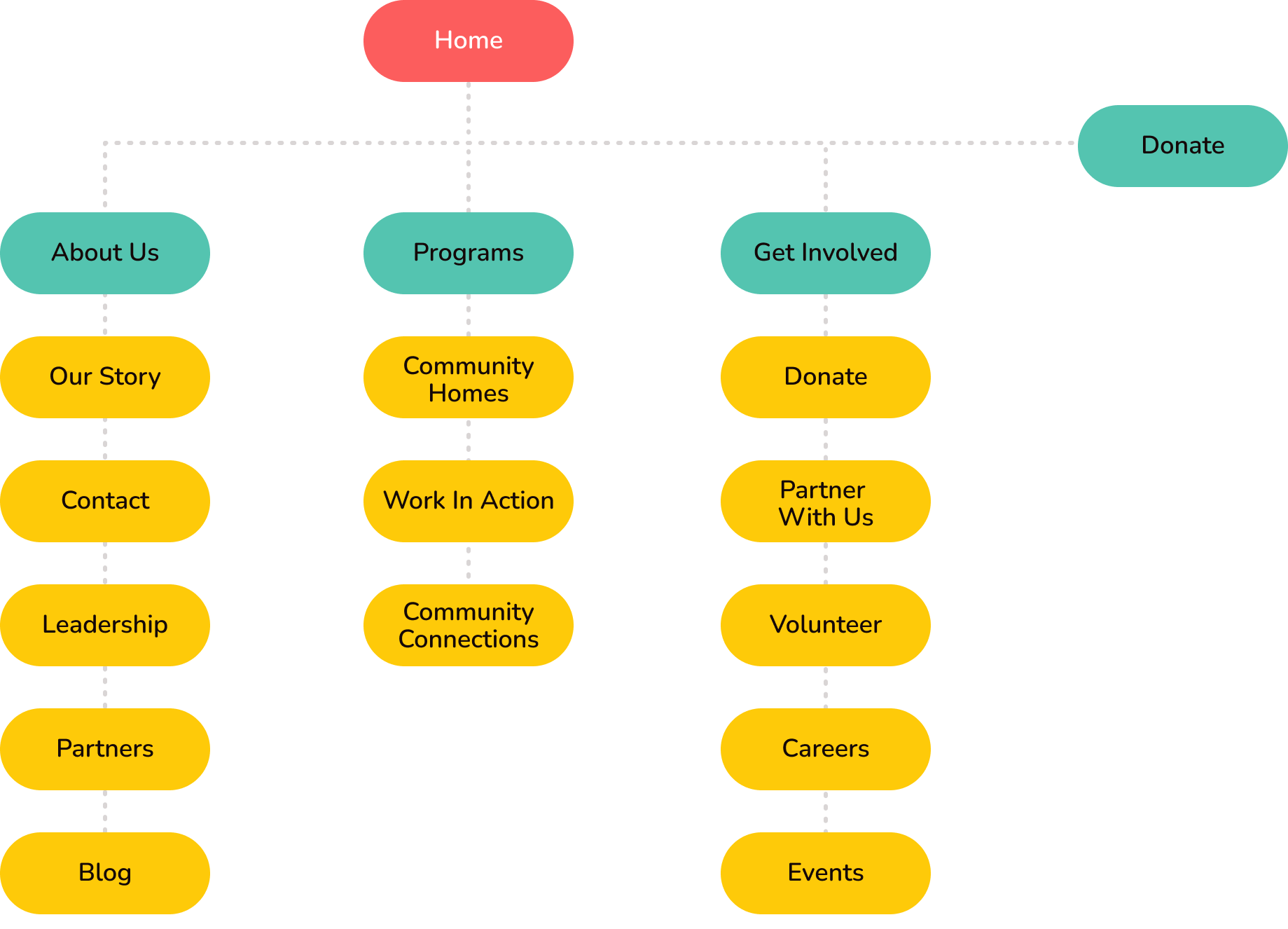
A sitemap was created based on the structure of competitor’s sites and Kainos’ goals. This helps me understand the interactions in order to restructure a whole website.
Design Iteration
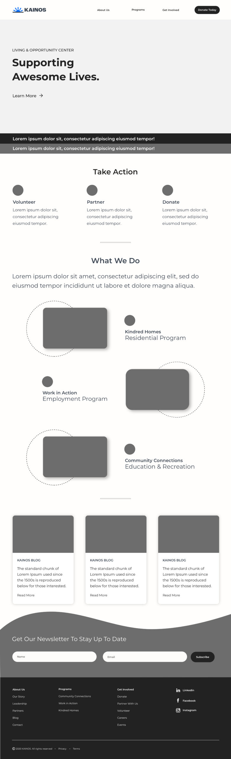
With Kainos’ mission and pain points in mind, I began with a grayscale wireframe. This allowed me to focus on the hierarchy, overarching themes, and structure of the page without worrying about color schemes yet. I paid attention to how different content pieces would be arranged in each page. The challenge was to convey clear messages in each section while maintaining warm, welcoming and sophisticated design.


Donation process in the original design confused users by having two different donation buttons next each other.
Based on the key findings from competitive analysis, I placed the donation button at the top right on the header.
The original landing page was so cluttered that it was hard to know what to look at.
The main actions that Kainos expect by users are right under the hero (volunteer, partner and donation). Each section will navigate users to a detail page.
Lack of information of the service.
Describing what Kainos does with a confident voice would help users take an action for volunteer and donate.
There was no specific information about Kainos' specialities.
Introduing detailed specialities with actual photos would welcome adults who need supports.
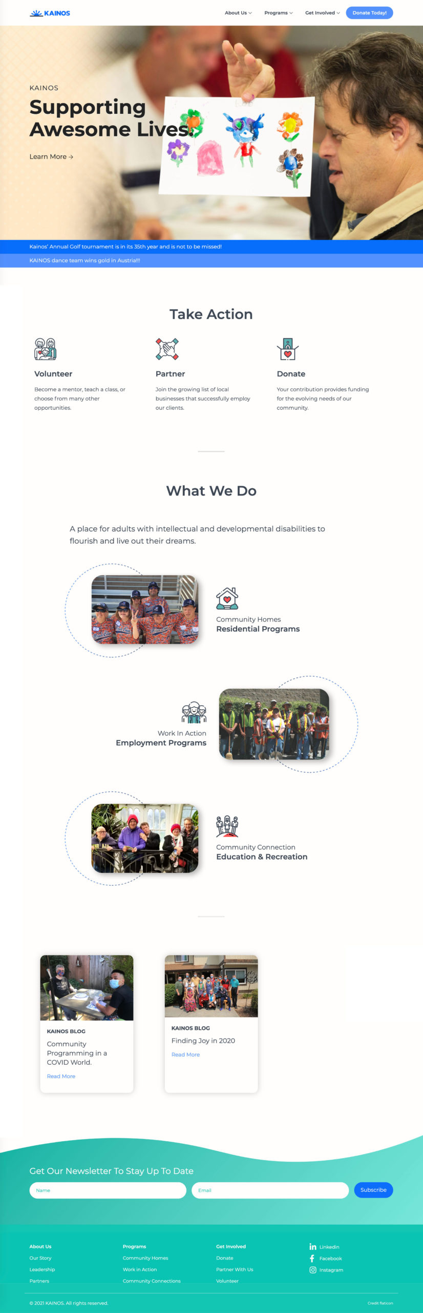
Since Kainos has been building their brand identity with the original logo and colors, I kept the logo design approach similar but made it more warm and impactful. The first iterations of colors were mostly light and muted. After this initial exploration, I realized the brand would be best served by a strong, confident voice, which would be reflected by dark, bold, high-contrast. colors.

Having received a thumbs up on the logo branding and general approach to the page, I began experimenting with different color, typography, and imagery.

The final design was made with the use of gradients, textures, and patterns to really emphasize the company’s unique branding and to give the visuals a lasting impact.

TakeAway
The Executive Director emailed me next day after launching the new design. He delighted to tell me that he had received a big amount of donation. I felt very content and confirmed that the design decision that I made was successful.
I also had a final meeting to hand off the design with the board of directors along with the team. The board of directors were very impressed with the new designs. These were the feedback I received from them.
